CASE STUDY
Wellspring Holistic
This is a hero section description that highlights your groundbreaking solutions for real-world challenges. Emphasize creativity, practicality, and value to inspire confidence in your innovative capabilities.
Name
The name was chosen through a process of thinking about how to express the nature of the business and ethos
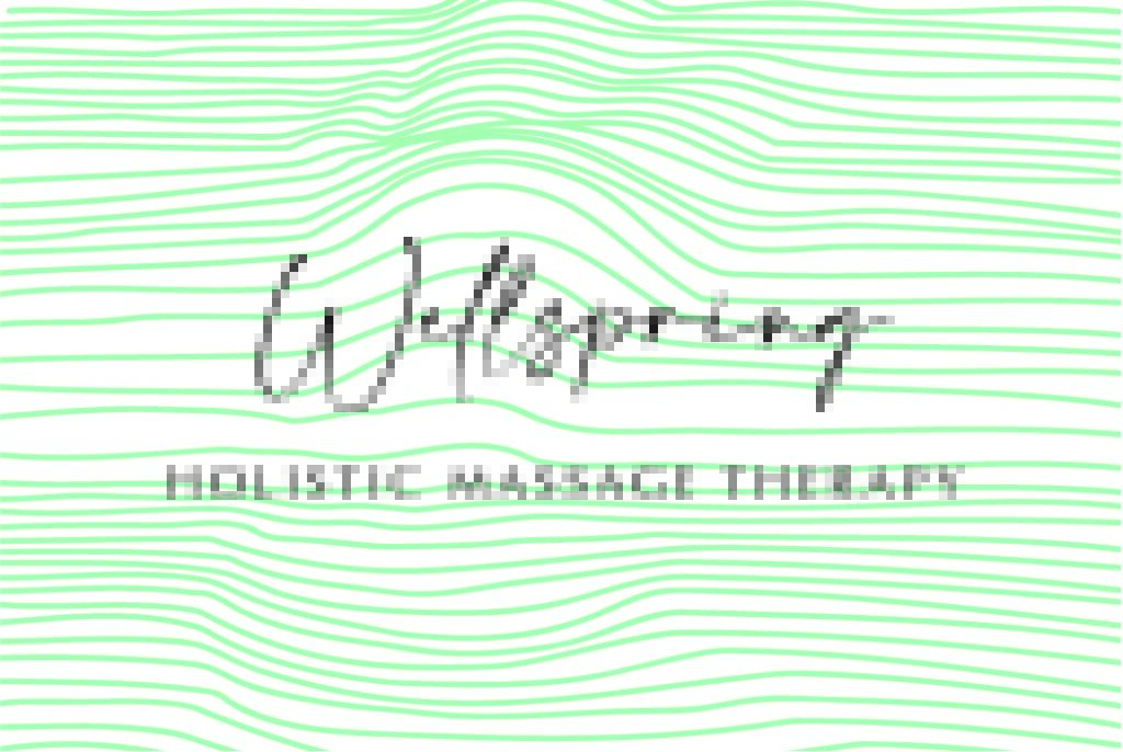
Wellspring
Well Spring
Combines the words ‘well’ and ‘spring’, which individually evoke – wellness, the season of spring, where things come back to life, and together, a source of clean water, the place good things come from. The words in general have associations of nature.
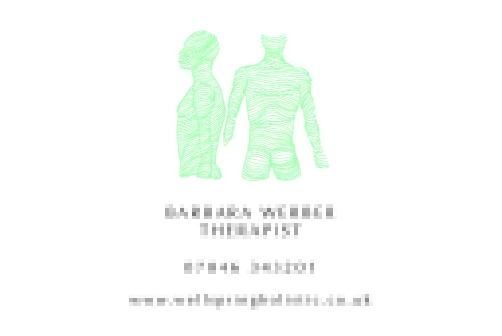
Logo
The typeface was chosen with the client as something that evokes a feeling of the personal: handwritten and flowing. A second typeface gives a solid foundation to the logo design.
Graphic design: colour palette, design elements
A simple colour palette was chosen which would be reflected in all design work to follow: a theme of white with pastel green and pink. The theme gives a soothing feeling to the site, helping the user to get a sense of the ethos of the business and the feel of the experience.
The parallel contour lines emerged as a design element and these have been used repeatedly through various designs. These give a sense of the contours of the body, relaxed muscle fibres which are separated and not knotted together. They give a sense of flow and smooth movement.
Advertising: print
Several print elements were developed including posters, a banner, flyers, business cards etc. These were all developed within the same brand guidelines.
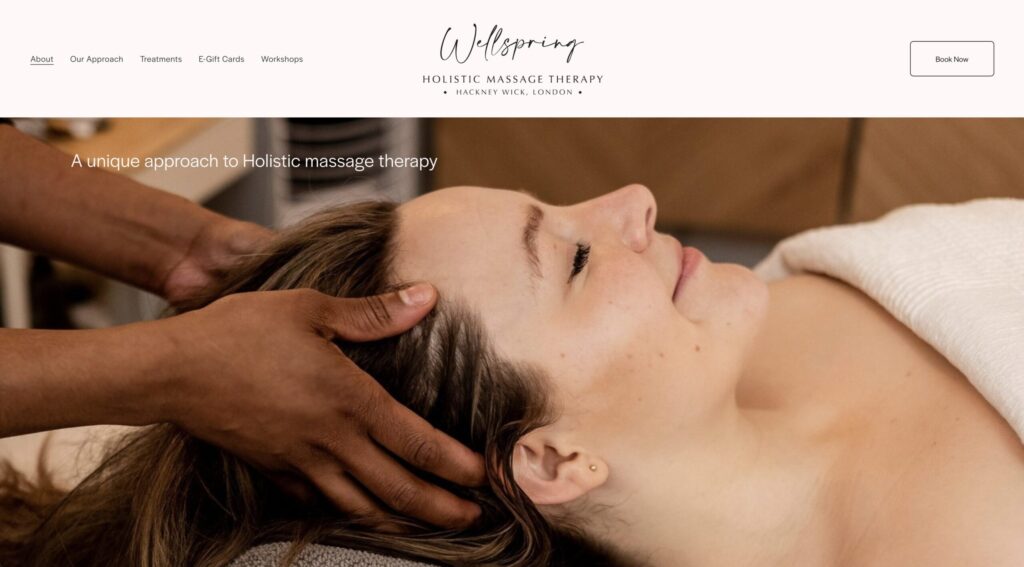
Website
The website was designed with aesthetics and functionality in mind and has developed iteratively over time to include new elements. The design adapts to mobile phone, desktop and tablet interfaces.
The copy was written to be easily digestible but to give a sense of professionalism and knowledge. Clients need to have confidence in a business of this kind to even try it, so a friendly tone was also key.
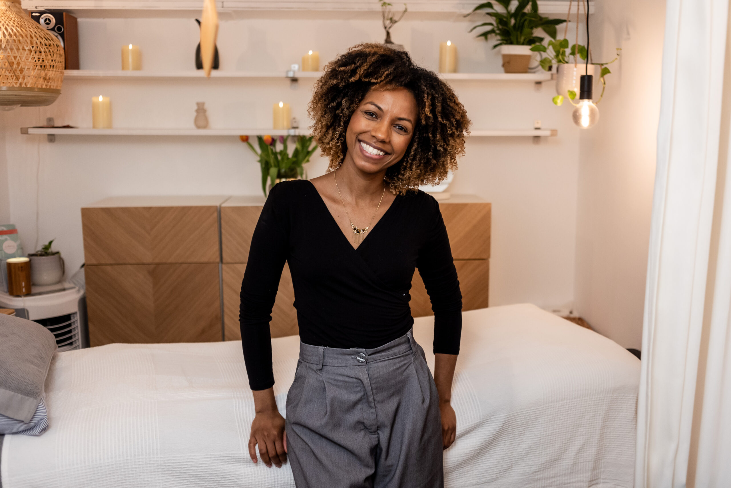
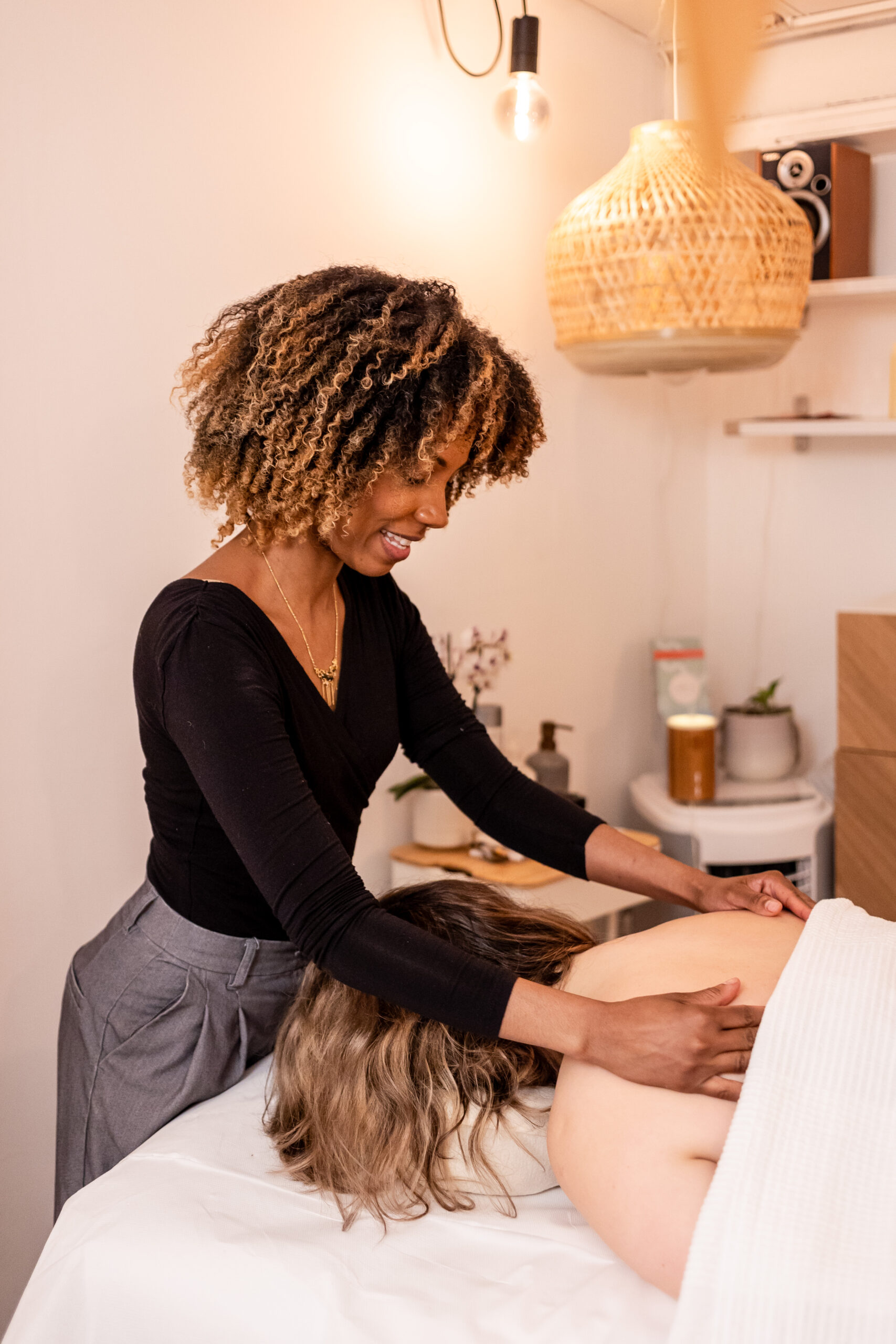
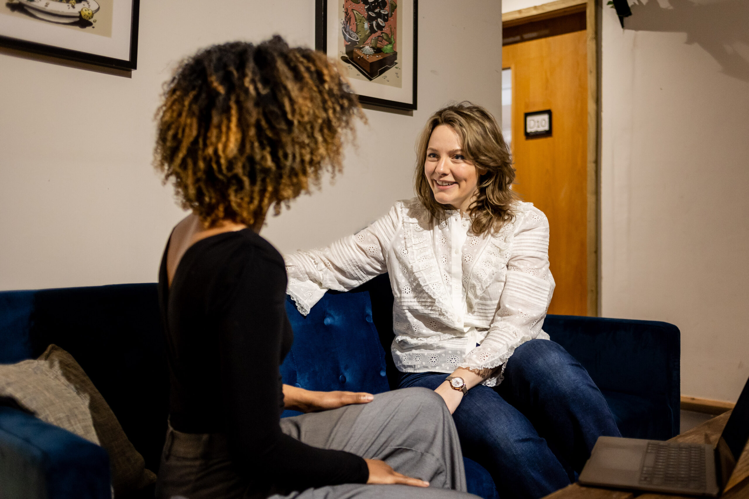
A series of photos was commissioned to show the treatment space, and give a sense of the client journey through a friendly initial consultation to treatment.
Sales integration, including scheduling
The website was built to interface with Square payment system and the Acuity scheduling system, enabling clients to book directly through the site.
SEO
We worked together with the client to maximise SEO.
Google Analytics setup
Google Analytics was employed to track engagement and responses to Google Ads.
Instagram Reels
Several Instagram reels were made to drive business. These were designed to give a feel of the client treatment experience.
Filming
We shot the videos with warm, subdued lighting to give a feel of a warm relaxing space. Details from the space and closeups of the body being massaged were shown to give a sense of the attention to detail and the way that vision changes when we are relaxed.
This video was later adapted to showcase some of the best reviews from Google.
Animated logos
Two versions of the logo were animated: one
A later addition was a treatment finder tool which asks the user a series of questions to establish which treatment type would be most suitable for them. This was to help solve to problem of clients booking the wrong type of treatment.